Blog

  • Question 4

    3. Visit the St. Clair College website. Analyze it strictly from a visual marketing strategy perspective targeting: Local domestic high school students. You are to provide three strategic visual enhancement recommendations. For each recommendation: 

    1. Clearly identify the issue or missed opportunity (3 x 2 = 6 Marks) 
    2. Propose a specific visual improvement (3 x 2 = 6 Marks)
    3. Explain why it would improve recruitment effectiveness (3 x 2 = 6 Marks) 
    4. Connect it to student psychology and digital behaviour (3 x 2 = 6 Marks) 

    Do not provide vague suggestions like: 

    • “Add more pictures” 
    • “Make it more modern”
    • “Use better graphics” 

    You need to be specific based on class content only: 

    • What type of visuals? 
    • Where? 
    • Why? 
    • What behavioural outcome would it influence? Think like a digital strategist. (24 Marks Total)
    1. Loosely Connected Visuals 
    1. From my observation, one of the areas that needs improvement is the programs section of the website. When you click on the program, there is a hero image that appears. The problem that I am seeing is that a lot of these pictures feel generic or like they are loosely connected to the topic of the program. This feels disingenuous and sort of lazy on behalf of the college.
    1. My proposed Solution for this is that rather than get images from the web for free or pay to license them, the college goes around and takes pictures of what happens in the program and of our students. 
    1. This would improve recruitment effectiveness because people could see the picture and develop feelings, thoughts, or questions about the program. For example, rather than showing a generic image of someone using a calculator, the civil engineering technician program. Go and take pictures of people using the CAD or surveying equipment.
    1.  This would help potential students develop an interest in the program and see more of what St Clair has to offer. This is also likely to boost open house attendance and program inquiries in general. In my case, I wasn’t sold on the advertising program until I talked to Steve, Casey, and some of the Grads. If we can get people in through the doors of the open house by developing interest, there is a greater chance of conversion. Additionally, they get to build human connections with grads, other students, and profs. This is important because Gen Z often has struggles with anxiety and feeling uncertain about their futures. This is why we can mitigate some of that, plus a positive human connection can never hurt when making a decision, let alone one as big as what career path to pursue.
    1. Facilities / Campus Images Section
    1. On the website, there is an option for a Virtual Tour. While this is a neat idea, I don’t think it is done to a very high degree of quality. When you click the virtual tour, there are options for which building you want to tour. While this is neat, there’s no map of where to go. If you have never attended college before and you have never been to that campus, how are you supposed to know where to look for your labs and classes?
    1. Why not take clear, high-resolution pictures of not only the facilities but also students using the facilities? Rather than walking around a near-endless building, of which you don’t know the layout, and you can’t see things in high resolution. Yes, it is a cool feature, but it needs to be either fine-tuned or reworked. My proposed solution is that rather than having a tour where you walk around, you can select what kind of program you’re interested in and then see what facilities you want to see. 
    1. This would increase recruitment effectiveness drastically. One of the biggest advantages that St Clair has over competing schools is its modern and advanced facilities. If students could see what they are working with more efficiently, that would retain their attention for longer and pique their interest in the programs that St. Clair has to offer, and our top-notch facilities. These are both things that are major factors when choosing the institution in which to pursue post-secondary education, and in comparison, we have the advantage over the University of Windsor and Fanshawe College.
    1. Using an image search or sections containing images can allow students to have a deeper understanding of what they get access to when they attend St. Clair, such as facilities, technology, etc. As I previously stated, students like to know what they are signing up for. There are a lot of uncertainties in our generation about how I’m going to get a job, a house, etc. One thing that they do have control over is the couple of years they spend in post-secondary education. It is one of the first big life decisions that young adults/teenagers make. Showing them what they are getting into and doing it well, focusing on the user experience of such a function, is very likely to get more students to enroll at St. Clair College. 

    3. Faculty Biography Section

    1. St. Clair College’s Sustainable Competitive Advantage, or SCA, is our faculty, plain and simple. This is extremely helpful when students get through the doors of the open house to meet faculty and grads, but this step typically comes after they have already developed an interest in our school. This does us no good if potential students don’t see, hear, or know anything about the faculty. 
    1. I propose that the college create a page on its website about the faculty.  This can be the professors’ department heads or anyone else. Additionally, I propose that we add a section of content under each of the programs, which will be the same biography or profile about professors of that program.
    1. This would improve the recruitment rate significantly. If we can prove that our faculty is a cut above by listing things like industry experience and credentials in a short biography or profile about them, students can see that they aren’t just learning theory from someone who has never worked in their industry; they can see that they are going to be mentored and taught by people who have valuable industry and life experience. This gives us an avenue to communicate our SCA with our audience in a way that gives them valuable information about the program they may be choosing.
    2. Students and young people enjoy connecting with others. Additionally, humans in general are naturally social creatures. We thrive on connecting with others. When you think about that in relation to how we make first impressions in advertising through visuals, and the small amount of time that it takes, having  a profile on the professors of the program that students are interested in will be monumental in gaining traction and interest within potential students.
  • Question 2 B

    2 B. (8 marks) Explain in detail how the image(s) strengthens the post from a digital marketing perspective. You may reference: 

    • Attention economy 
    • Scroll behavior 
    • Visual hierarchy 
    • Brand perception 
    • Trust building 
    • Emotional triggers 
    • Information processing 
    • Conversion influence: Be analytical. 

    This is not a design reflection. This is marketing reasoning. 

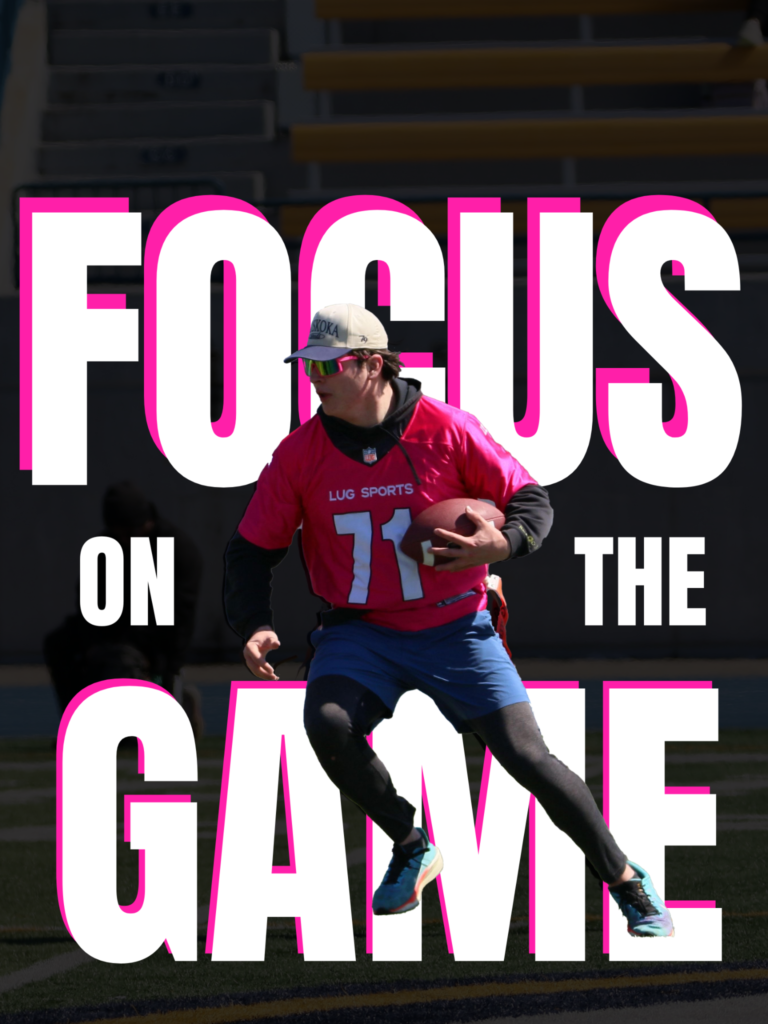
    This choice of imagery in this post strengthens the post overall and ties everything together. The Image is front and center and in full colour as opposed to being blacked out, so that it catches your eye right off the bat, drawing your eye to the center of the page. This helps increase the reader’s attention span. As we discussed in class, first impressions are made within 50 milliseconds of seeing the ad, so getting their attention quickly and keeping it is crucial. This is also why I opted to put the image in front of the text, so that you see the image first, then read the text behind the athletes to get the full effect. This is an element of visual hierarchy and understanding how people read. This differs from the pattern because that is about how people read lots of words; images change the way people perceive information and, therefore, also change the way people read when there are visuals present. 

    The emotional triggers of the image also complement the text. As I talked about briefly above, the image is meant to instill a sense of purpose and individuality, making the reader feel like the main character. This makes them feel like they are important, or rather, they don’t feel the way they want to know how they can feel that way. Athletes are different from non-athletes; they understand the hustle and being driven and wanting to stand out, and the message that we are trying to give them is that they can feel that way, progress, and be seen at Catalyst Photography. This also aligns with the values and branding of Catalyst Photography. We want to give our clients that feeling of being important and being seen and celebrated. It sounds cliché, but if we can make them feel that way and elevate their confidence, that is why they will keep coming back to us. This element of having repeat customers is important to our business, as sports are seasonal, and we want to build a strong year-round clientele, so having repeat customers gets us more work every season.

    The font choice is also meant to complement the image as well. The reason for this is cohesiveness, so that they play off of each other. The font is strong and built, which is in alignment with the subliminal messaging we want to give to our viewers and how we want our athletes to feel. This also helps with brand identity because we want to be associated with that feeling of being strong and bold, and we want our clients to feel that way as well, and we want prospective clients to know that’s how they are going to feel when they choose to ally with Catalyst Photos.

  • Question 2 A

    2. A. Why did you choose the specific image(s)? Your explanation must include: 

    a) Business relevance 

    b) Target audience alignment 

    c) Image intent 

    d) Why this visual works better than alternative visual approaches

    1. I chose this specific image to use in my blog post for a number of reasons. The First being that it is very relevant to my sports photography business. Catalyst Photography is a sports photography firm, and one of the service options that we try to promote as our staple service, the main thing that we do is individual athlete photography. This picture is a very good representation of that service. Additionally, the jersey is very similar to the pink used in the Catalyst Photos website and logo, which gives us more subliminal messaging. 
    2. This post targets our more serious athletes who are further along in their athletic careers. 15-20 years old. Athletes at this age start to really get serious about their sport and zero in on their goals. This post is telling them that they can focus on the game and push out the noise, hence the darkened background and the prominent athlete featured. The idea is that they would see this image/post and picture themself in that post rather than the athlete on it. It’s meant to be inspirational and make them feel like the main character or focus. 
    3. I am using the image for a few specific reasons, as I have previously said. Images are meant to evoke emotion, trigger a different part of your brain, and communicate subliminal messages. This image specifically has no other players and no other action happening around the athlete in the subject, which implies heavy emphasis on the subject. On the other hand, the subject or athlete in this image looks very intense and like they are playing very hard, which implies that they are focused, which ties to the darkened background and the text used behind the athlete. The reason the text is behind the athlete again reinforces that the athlete is the main focus and they are the star of the show, which is the message that we are trying to infer.
    4. This visual is more effective than other methods due to the messaging that it communicates to the viewers. Other visuals could communicate our message in the same way, but I felt as though this one was actually perfect for the intended purpose of my blog for the reasons I have stated above. The tone of the message is inspirational and meant to instill a sense of purpose and individuality in our target audience. Obviously, you can edit visuals to fit your purpose as I did minimally with this one, but it’s about being intentional about what you are communicating and who you are communicating with. Other pictures could be used, but the way those visuals are edited for your purpose is what matters. This visual is the best representation of the message of being dedicated and focused on what matters to you, which, for our audience, is their sport.
  • Question 2

    1. This is a multi-part question. Please create a visual post for your blog on a topic specific to your business and answer the questions below. You will create a visual-first blog post for your business website. This involves critical thinking. What is important to your business and visitors? This is not a written article with an image added. This must be: 
    • Image-led 
    • Message-driven 
    • Minimal text 
    • Strategically intentional The image(s) must carry the meaning. You may use: 
    • Photography 
    • Original graphics 
    • Screenshots 
    • Edited visuals 
    • Multi-image carousel format 
    • Before/after comparison 
    • Visual storytelling sequence 
    • Etc. 

    The key requirement – If the text was removed, the visual would still communicate the core message. Please pay attention to what was discussed in class. Ensure that you include a link to the blog post in your answer. Do not forget that this needs to be included in your hardcopy. I am marking what you hand in with your hardcopy but also need to see the digital version on your blog. If it is not online for me to view (in addition to the hardcopy), I cannot mark this question. (4 Marks) You must: 

    • Include the visual post in your hardcopy. 
    • Publish the post on your blog under a category titled “Assignment 4”
    • Include the direct URL in your hardcopy 
    • Ensure your blog navigation is working and accessible

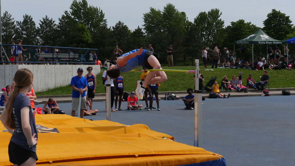
    Below, I have included my design for the blog post as well as a screenshot of the blog. One of the things that Catalyst Photography communicates to its audience is that we make every effort for the ease of our Clients. I have content about this on my homepage for catalystphotos.com. The reasoning for the post below is as follows. The background is darkened to convey more emphasis on the athlete, who is me in this case. This is meant to be subliminal messaging and symbolic of our focus on the athlete and the game that they play. It’s all about the athlete, which is directly taken from content that I just developed for my next SEO update. The text uses the catalyst photography, pink as well as white, to pop out from the background. While this post works with just the text or just the visual, the purpose of both is to complement each other for a stronger overall message within this post.

  • Question 1

    1. Question 1 Visuals are not decoration. They are communication tools. Provide three strategic reasons why visuals are essential to effective web content. For each reason: 

    Clearly explain the concept 

    Provide a real-world example (not generic statements) Marks are awarded for depth, not surface-level answers. (6 Marks)

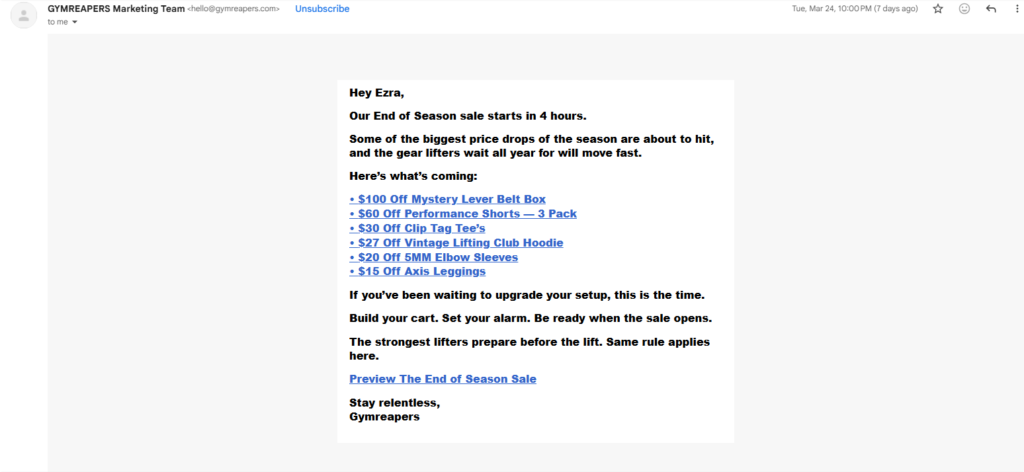
    Images attract more attention to your content. As in the class powerpoints, 90% of the information your brain registers is through imagery and visuals. A real-world example of this is something that we talked about in an email. In email, when you just have a block of words, it isn’t visually appealing, and it’s overwhelming for the reader. The rule of ” don’t make me think,” which we discussed in class. This is a mental turn-off for the reader because they don’t want to put effort into understanding. When you add visuals to complement your images, it makes it easier for a reader to understand because images trigger a different part of the brain than words do. Here is an example of what I am talking about.

    Email with Only Text

    Email with Images and Text

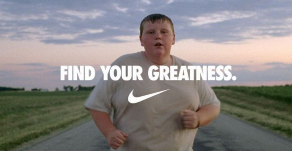
    Images help with memory recall. We also discussed this in class, how people only remember about 10% of text-based information 3 days later. When you pair it with a strong, relevant visual, that number jumps to 65%. This is because images trigger a different part of the brain, as I said above. Images can trigger emotions and subliminal messaging, which sticks with you much longer than text-based information. An example of this is the Nike ” Find Your Greatness ” campaign. The one that I think is the best example of this is an overweight child jogging down an empty road. This image resonates with a lot of people because a lot of people can identify with struggling with body image. This emotional trigger sticks with people a lot longer than simply displaying text that says ” find your greatness and a bunch of text. This sticks with me particularly; we talked about this ad in a class with Anita in the first year, and I still remember it a year later, which speaks to the amount of recall that that post carried.

    Visuals increase engagement. Per one of the class powerpoints, roughly two-thirds of consumers say that visuals are extremely important when it comes to a purchase decision. We can infer from this that having strong visuals impacts two-thirds of consumers’ conversions. One of the best platforms for engaging and communicating with your audience is social media platforms, and one of the biggest metrics on social media is engagement. This is largely because social media is a highly visual platform based on imagery and video. An example of increased engagement due to visuals is a project I worked on designing for social media. I don’t have access to the account anymore, but I do have the designs. The design with more imagery did better by a significant margin on both Instagram and Facebook.

    Post with Strong Visuals (performed well. More likes, shares, and comments)

    Post with Weaker Visuals (almost no engagement, just views)

  • Welcome to Catalyst Photography

    Catalyst Photography is a sports photography firm local to Windsor-Essex, Ontario. We specialize in capturing our clients’ best sporting moments. We focus on delivering the highest quality images from the local sports scene so that you can relive the moment long after it has passed.

    We cover a wide range of sports, including but not limited to:

    • Volleyball
    • Soccer
    • Hockey
    • Football
    • Baseball
    • Basketball
    • Figure Skating
    • Track and Field

    Check Out our Blog
    http://blog.catalystphotos.com/

  • Question 4

    There are several things I changed from the initial post. For starters, what we learned about voice and tone and the overall profile that you want your business to have changed my stance on a few things. I wanted to use more language that was inspirational and helpful towards regular people, rather than sounding overly factual and professional. Our strength as a business is going to be having a good relationship with athletes and our clients, so using this type of language in an introductory post sets a better tone for who we are.

    As I mentioned above, I also changed the post to directly address what the bulleted list is for rather than just throwing it on there. This helps readability and overall smoothness of the read. Having a better understanding of the F pattern and knowing how people read this just makes sense to have in there. As we saw with the heatmap, people tend to land on headings and subheadings rather than read what is directly under that, so having the subheading there increases the likelihood that they will see it and therefore understand what the list is in reference to. 

    Additionally, I changed some of the design elements to better complement my brand. The link for the blog is the catalyst photography pink now; the opacity of the background for the text is dropped, which makes it pop more and is easier to read, and the headline spans across the width of the post rather than just the top left.

  • Question 3 b

    The most prevalent thing that I struggled with writing in plain English using the F pattern was dumbing down the language to the point that a normal person can read it. In my mind, I want to talk about the unique equipment we use or the specs of the cameras and use all sorts of photography terminology, but our audience isn’t photography experts; it’s normal people who don’t understand all of that and wouldn’t even know if it affects them in any way. Additionally, because we are farther along in the semester, I have a better grasp on my business idea and more ideas that I want to communicate with potential readers. But I need to condense that down and simplify it because I am not writing for me, I am writing for my target audience that will read this. I overcame this obstacle by having my mom and sister read a few different versions of my content as I was writing it, and pointing out to me parts that they did not understand or thought were irrelevant, which led me to what I have now and will be submitting. I had to cut all of the technical speak and terminology because, after all, this is an introductory post, and you need to assume that the vast majority of readers won’t find that at all useful or relevant to their purposes.

  • Question 3 a

    One technique I used in both my revised version and my initial version was laying out the sports we cover with bullets rather than using a paragraph format. The reason I did this is so that when skimming using the F pattern, a person is more likely to quickly comprehend a bulleted list and find what they need quickly, rather than reading an entire paragraph of fluff and losing interest in our content. An additional element I added was a quick subhead above the list to declare what the list actually is. This helps readability because in the first revision of my introductory post, I feel as though the list is just sort of thrown in there, and you have to actually read the content above to understand what the list is in reference to. In this version, it simply explains what we have done and can do. This helps because if you are just skimming, you can still understand the content on a higher level. I also use this list to reinforce the content above, which the subheading helps with. Now, rather than just a list being there on the page, it flows much nicer when reading it because the list directly correlates to the subheading, which directly correlates to the paragraph above, making it a smoother transition and less choppy.

  • Question 3

    The three main objectives of writing in plain English are as follows. 

    • The reader can find what they need. This refers to whether or not your information is communicated well to the reader for their ease. They do not want to search and analyze your writing to find what they are looking for. There are a number of elements that can help a reader find what they are looking for easily, but at the core, it is about understanding how someone reads content and understanding the F Pattern. If you understand the F pattern, then you know how to lay out your information so that it is easy for a reader to find. My post is an introductory post about Catalyst Photography. As such, I want to say right off the bat who we are and what we do because people start at the top right and skim left to right, and that tapers with every line, so you need to have the most prevalent information right at the top left. In my post, it says Catalyst Photography is a sports photography firm local to Windsor-Essex, Ontario. Right off the bat, they know who we are, where we are, and what they do. Which is the most relevant part of this post, as it is supposed to be introductory. Furthermore, if they are interested in us, I use a bulleted list with a short description at the top of the list saying what it is. Using a list rather than a paragraph format gives the reader an easier way to skim and find what they are looking for. 
    • The reader can understand the content. We discussed in class that writing in plain English isn’t using slang,  gibberish, or dumb speak. The reader needs to grasp the concept of what it is that you are trying to say. There is a fine line that you need to walk between sounding professional and intelligent and sounding unintelligent and lazy. Writing in plain English is about conveying complex ideas with simplicity so that any reader with any level of knowledge can understand them. In reference to photography specifically, there is a lot of technical knowledge about specs of cameras, resolution, and terminology that you need to condense down into something that a normal person can comprehend. So rather than us saying we shoot with a 200 mm zoom lens with a 4k resolution, in my post, I say “we focus on delivering you the highest quality images.” This conveys our complex point into something that a consumer can comprehend and appreciate. 
    • The reader can use your content to fulfill their purpose. The content on my introductory post is supposed to provide the reader with a service that they need. In this case, you want or need a high-quality image or video of a sport or an athletic outlet. My content tells you what it is that we provide our customers with. Meaning that if they are interested, they can visit our blog, which will be linked, and learn more about us and see examples of our work.